Many homeowners assume any bold or dark cabinet color will shrink their compact kitchen even further. That fear is understandable, but it's not the whole story.
This guide rounds up designer-backed cabinet color picks for small kitchens, what to skip, and how to pair your choice with countertops so the room reads open and current rather than cramped.
Key Takeaways
- White and light gray remain the safest choice for visually expanding a small kitchen
- Two-tone layouts with light uppers and deeper lowers add depth without closing the room in
- Sage green, soft blue, and muted earthy tones add personality when balanced with reflective surfaces
- Glossy and satin finishes bounce more light than flat matte, a real advantage in tight spaces
- Cabinet color works best when chosen alongside countertops and hardware, not picked in isolation
Why Cabinet Color Choice Matters More in Small Kitchens
Cabinets often cover more square footage than walls, floors, or windows combined in a compact kitchen. Designers frequently apply the 60-30-10 rule here: 60% dominant color (usually cabinets), 30% secondary (walls or countertops), and 10% accent. Paint and design guides frequently cite this same framework, with cabinets typically carrying that 60% weight.
That's why the cabinet color you pick effectively becomes the room's personality.
The Light Reflectance Science
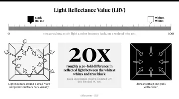
That personality is rooted in physics as much as taste. Light Reflectance Value (LRV) measures how much light a color bounces back, on a scale of 0 to 100. The gap between light and dark is dramatic:
| Color | LRV |
|---|---|
| Behr Polar Bear (white) | 90 |
| Benjamin Moore White Dove (off-white) | 83 |
| Benjamin Moore Gray Owl (light gray) | 64.5 |
| Benjamin Moore Black HC-190 | 4.56 |
That's roughly a 20-fold difference in reflected light between the whitest whites and true black, based on Benjamin Moore's published LRV data for Black HC-190. Light bounces around a small room and pushes surfaces back visually; dark absorbs it and pulls walls closer.
Match Your Palette to Your Light Exposure
North-facing kitchens get cooler, flatter light throughout the day. Warmer undertones and higher-LRV colors tend to counteract that chill. South-facing kitchens already run warm, so cooler cabinet tones often read more balanced instead of stark. Check which way your windows face before falling in love with a swatch.
Designer-Picked Best Cabinet Colors for Small Kitchens
These five picks reflect designer consensus, light-reflecting performance, and versatility across kitchen styles.
Classic White & Warm Off-White
White remains the top upgraded-cabinet color among homeowners, and by a wide margin. According to the 2025 US Houzz Kitchen Trends Study, white cabinets made up 33% of upgraded kitchens, with off-white adding another 14%. Gray trailed at just 6%.
- Cool white suits north-facing kitchens and pairs cleanly with chrome or stainless hardware
- Warm white or cream works better in south- or west-facing rooms, especially with butcher block or brass accents
- Straight white can feel sterile; an off-white like CKF's Marshmallow Cream finish on Fieldstone maple cabinetry softens that clinical edge while keeping the brightness
Light Gray
Gray offers a modern alternative to white while hiding smudges and fingerprints better on high-traffic cabinet fronts. CKF's 360 Classic line offers this in its Oyster finish on maple, a light gray that still reads bright rather than heavy. Oyster's cool undertone pairs especially well with brushed nickel or matte black pulls, giving small kitchens a crisp, contemporary look without feeling washed out.
One caution: mid-to-dark grays behave more like dark colors in tight spaces. Stick to the pale end of the gray spectrum for a small kitchen, and pair it with warm wood floors or brass hardware for a transitional look, or matte black for something more contemporary.
Soft Blue & Sage Green (Pastels)
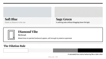
Pale blue reads as "distance" to the eye, which is exactly why designers favor light-to-mid blue over navy when covering full cabinet runs in a small room. Sage green has become a strong 2026 favorite, adding a natural, calming note without dragging down the light in the room.
CKF's Diamond Vibe line demonstrates this well: its Retreat finish, a muted green on painted hardwood uppers, keeps the tone soft enough to preserve openness. The rule for both colors: stay in their most diluted, high-white form. A saturated sage or navy-adjacent blue starts behaving like a dark color.
Warm Wood Tones
Blonde woods like maple, birch, and white oak reflect more light than dark stains while adding organic warmth, a hallmark of Scandinavian kitchen design. This isn't a passing preference either. NKBA's 2026 Kitchen Trends Report found that 59% of kitchen professionals expect wood grain to overtake painted cabinets in popularity, with white oak leading at 51%.
- Fieldstone's Maple in Marshmallow Cream Tinted Varnish delivers a true blonde, airy look
- Quarter Sawn White Oak with a Tarragon Stain brings out grain character while staying light
- Sheen matters just as much: satin or semi-gloss reflects more light than matte, while high-gloss can look artificial and shows fingerprints fast
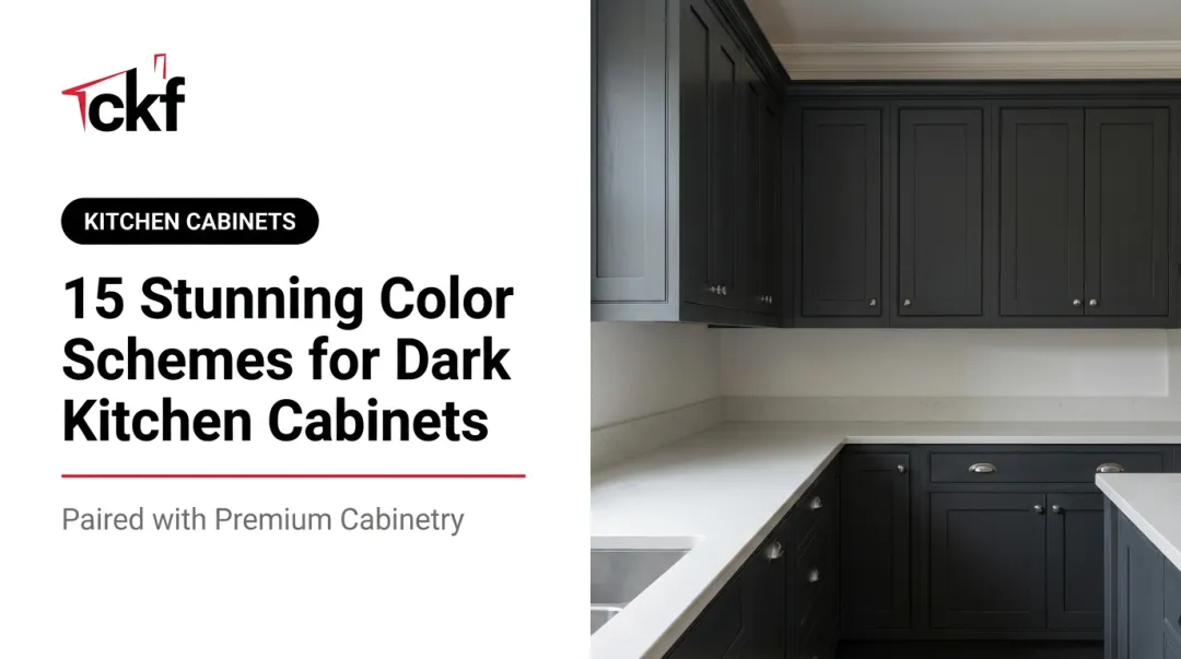
Two-Tone & Strategic Dark Accents
Pairing dark lower cabinets with light upper cabinets is the safest way to bring in depth without losing openness. Houzz reports 24% of renovated kitchens now use contrasting cabinet colors, with wood-tone lowers leading that group.
CKF's 360 Classic showroom display puts this into practice with Frontier White uppers paired against Foxhall dark wood lowers, finished with Atlas hardware and a Silestone Ethereal Glow Suede quartz countertop tying the two tones together.
Confining a bold color to just an island or one accent wall works the same way: it creates a focal point instead of a wall of darkness. Either approach depends on strong lighting; under-cabinet LEDs and pendants counteract whatever light the darker tone absorbs.
Pairing Cabinet Colors with Countertops & Hardware
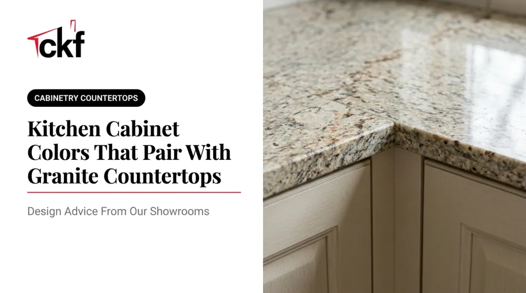
The best cabinet color is the one chosen alongside your countertop, backsplash, and floor, not picked first and matched later. Mismatched pairings can undercut the entire space-expanding effect you're after.
General pairing guidance:
- Light cabinets with light quartz create nearly seamless visual expansion
- Light cabinets with a darker stone counter add contrast without adding visual weight
- Colored cabinets (blue, green, wood) pair best with neutral countertops and simple backsplashes, such as subway tile, glass, or light natural stone, to avoid visual clutter
CKF's showroom examples reflect this pattern directly. Muted green Diamond cabinetry is paired with a Silestone quartz countertop featuring a marble-like veining, keeping the palette calm. Meanwhile, white cabinetry gets paired with Dekton Stonika Bergen, a grey-and-white veined stone, plus gold hardware for a polished finish.
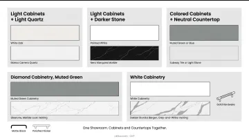
On hardware, matte black shows up most often across CKF displays paired with white or light gray cabinetry, while polished nickel offers a brighter, more classic alternative.
That pairing philosophy carries into the shopping experience, too. Because CKF fabricates its own countertops in-house alongside its cabinetry lines, homeowners can view cabinet doors and slab options together in one showroom visit. There's no need to juggle separate appointments with a cabinet shop and a stone yard.
Cabinet Colors That Feel Outdated in Small Kitchens
Some finishes that once dominated builder-grade kitchens now read as visibly dated, particularly in a small footprint where every surface gets scrutinized.
- Heavily yellowed, honey-toned oak from the 1980s and 90s often clashes with cool-toned countertops, though a niche revival among some designers makes this trend more polarizing than fully rejected
- Icy, ultra-cool white or gray schemes from the 2010s can feel clinical next to today's warmer, softer neutral trend
- All-dark cabinetry with no lightening strategy is falling out of favor in compact kitchens, even as moody dark kitchens remain popular in larger, more forgiving layouts
How to Choose the Right Cabinet Color for Your Small Kitchen
Start with what you can't change before locking in what you can.
- Assess your natural light exposure first. North-facing rooms lean cooler; south-facing rooms run warmer. Let that guide whether you go warm-neutral or cool-neutral.
- Look at your flooring and countertop plans. Cabinet color should complement what's staying, not fight it.
- Order physical samples, not just photos. Paint and door finishes shift dramatically under your kitchen's actual lighting, morning to evening.
- Get a second set of eyes. A design consultation helps you visualize a color in your exact layout before you commit. CKF's design teams across its Midwest showrooms pair cabinets and countertops together, catching mismatches before installation.
Frequently Asked Questions
What cabinet colors make a small kitchen look bigger?
White and other light, cool neutrals reflect the most light and create the strongest illusion of space. Light gray and pale pastels like sage or soft blue are close seconds.
What cabinet colors are trending for small kitchens in 2026?
Warm off-whites, sage green, soft blue, and two-tone layouts are all gaining ground. White oak and muted earthy tones with strategic dark accents are also on the rise.
Which cabinet colors for small kitchens are outdated?
Honey-toned oak, ultra-cool icy whites and grays, and heavy high-gloss finishes are the main colors designers are phasing out. Honey oak does have a small niche revival among some designers, though.
Can I use dark cabinet colors in a small kitchen?
Yes, when confined to lower cabinets, an island, or paired with strong lighting and light-colored uppers. A full room of dark cabinets with no balancing element is riskier.
Should small kitchen cabinets be matte or glossy?
Glossy and satin finishes reflect more light and suit small kitchens better than flat matte. Many designers use satin as the sweet spot between shine and practicality.
How many different cabinet colors should I use in a small kitchen?
Stick to one or two colors maximum, such as a monochromatic scheme or a clean two-tone pairing. This keeps the eye moving freely instead of catching on visual clutter.