Introduction
The appetite for depth and drama in kitchen design is real and growing. Houzz data shows searches for "moody kitchen" rose 101% year over year in Q1 2024, confirming that homeowners want kitchens with personality — not just function. In 2026, dark cabinets aren't a trend. They're a design standard.
The challenge isn't choosing dark cabinets. It's knowing what to pair with them. Without intentional color choices across walls, countertops, backsplash, and hardware, dark cabinetry can feel heavy rather than striking.
This guide covers 15 complete color schemes — not just wall color suggestions — organized by five dark cabinet color families: black, navy, espresso, charcoal gray, and deep forest green. Each scheme treats the kitchen as a full palette, giving you a concrete starting point whether you're remodeling from scratch or refreshing what's already there.
Key Takeaways
- Balance dark cabinets with at least one lighter element — countertop, wall, or flooring
- The most versatile 2026 dark finishes: black, navy, espresso, charcoal gray, and deep forest green
- Hardware finish shapes the whole mood — brass warms, chrome crisps, black-on-black dramatizes
- Layered lighting (ambient, task, and accent) is non-negotiable with dark cabinetry
- Every scheme works across all five surfaces — cabinets, walls, countertops, backsplash, and hardware
Why Dark Cabinets Are a Design Powerhouse
Dark cabinets create depth, richness, and drama that lighter cabinetry simply can't replicate. The fear that they'll make a kitchen feel cramped is largely unfounded. With the right contrast elements and proper lighting, dark cabinets define a space more sharply, making it feel deliberate and intentional rather than confined.
The professional design community is firmly on board. NKBA's 2026 Kitchen Trends Report, which surveyed 634 kitchen and bath professionals (67% of them designers), found green cited by 86% and blue by 78% as popular kitchen colors. While these figures reflect kitchen color broadly rather than cabinet fronts exclusively, they signal strong professional momentum behind the deep, saturated tones that define dark cabinet design.
Dark cabinets also span nearly every design style — modern, farmhouse, traditional, and transitional — making them a long-term investment that works across remodels, resales, and shifting tastes. That range is exactly why the 15 color schemes below cover such different directions.
15 Stunning Color Schemes for Dark Kitchen Cabinets
These schemes are organized by cabinet color family to help you find the right starting point. Each palette covers walls, countertops, backsplash or accent materials, and hardware together — because no single element exists in isolation.
Black Cabinet Color Schemes
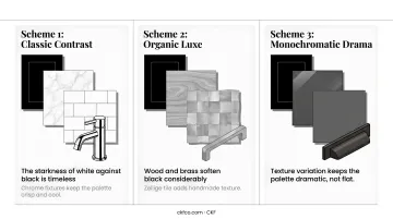
Scheme 1 — Classic Contrast
- Black cabinets
- White marble or quartz countertops
- White subway tile backsplash
- Polished chrome fixtures
The starkness of white against black is timeless. This combination reads as high-end in virtually any kitchen layout — modern, transitional, or even traditional with the right cabinet profile. Chrome fixtures keep the palette crisp and cool rather than warm.
Scheme 2 — Organic Luxe
Black cabinets + warm wood butcher block or light oak countertops + natural stone or zellige tile backsplash + brushed brass hardware
Wood and brass soften black considerably. The warmth of both materials pulls the palette away from stark and toward something inviting and layered. Zellige tile adds handmade texture that keeps the backsplash from feeling too polished or corporate.
Scheme 3 — Monochromatic Drama
Black cabinets + dark gray or soapstone countertops + matte charcoal tile backsplash + dark bronze fixtures
When you want a fully moody kitchen, this tonal approach delivers. The key is texture variation — matte tile against the slightly reflective soapstone, and the warmth of dark bronze against flat black cabinetry. Without those textural shifts, the palette risks looking flat rather than dramatic.
Navy and Dark Blue Cabinet Color Schemes
Scheme 4 — Coastal Classic
Navy cabinets + crisp white quartz countertops + white or off-white subway tile backsplash + polished nickel hardware
One of the most universally appealing dark cabinet combinations available. The white elements deliver fresh contrast while the navy holds its richness. Polished nickel keeps the palette from veering nautical-cliché, landing instead in timeless territory.
Scheme 5 — Modern Nautical
Navy cabinets + warm gray walls + light veined stone countertops + brushed gold fixtures
The gray wall color is doing real work here — it bridges the cool depth of navy and the warmth that gold hardware introduces. Light veined stone (think a pale quartzite or soft marble) adds movement without competing with the cabinetry. This palette performs particularly well in kitchens with natural light, where the gray walls shift warmer through the day.
Scheme 6 — Warm Farmhouse
Navy cabinets + warm off-white walls + butcher block countertops + copper or oil-rubbed bronze hardware
Navy doesn't have to feel formal. Pair it with warm off-white walls and wood countertops, and the result is approachable and cottage-like. Copper hardware adds an earthy warmth that keeps this from sliding into coastal territory — better suited for open-plan kitchens with wood floors or farmhouse details.
Espresso and Dark Brown Cabinet Color Schemes
Scheme 7 — Warm Traditional
Espresso cabinets + cream or beige stone countertops + tumbled travertine or warm-toned tile backsplash + oil-rubbed bronze hardware
Espresso reads warm, not cold — and this palette leans fully into that quality. Cream stone and travertine tile create a cozy, layered look that ages beautifully. Oil-rubbed bronze hardware ties the warm tones together without introducing any harsh metallic contrast.
Scheme 8 — Earthy Harmony
Espresso cabinets + terracotta accent wall or terracotta tile details + natural quartzite or stone countertops + matte black hardware
The rich brown undertones in espresso have a natural affinity with earthy, saturated tones. Terracotta brings that organic warmth to the surface — either as an accent wall color or incorporated into the tile. Matte black hardware keeps the palette grounded without going cool.
Scheme 9 — Contemporary Contrast
Espresso lower cabinets + white upper cabinets (two-tone) + white quartz countertops + brushed silver hardware
The two-tone approach is one of the most practical moves in dark cabinet design. White uppers immediately lighten the visual weight of the espresso lowers, and white quartz countertops amplify that effect. This scheme works in kitchens where natural light is limited.
Charcoal and Dark Gray Cabinet Color Schemes
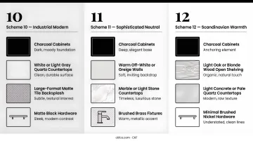
Scheme 10 — Industrial Modern
Charcoal cabinets + white or light gray quartz countertops + large-format matte tile backsplash + matte black hardware
Clean, contemporary, and direct. Large-format tile minimizes grout lines for a sleek backsplash that matches the cabinet's refined austerity. Matte black hardware echoes the charcoal without vanishing into it — creating just enough tone-on-tone definition.
Scheme 11 — Sophisticated Neutral
Charcoal cabinets + warm off-white or greige walls + marble or light stone countertops + brushed brass fixtures
Charcoal has cool undertones that can read cold in the wrong context. Warm greige walls and brushed brass fixtures solve that immediately, shifting the whole palette toward polished and livable. It's a strong choice for open-plan spaces where the kitchen flows into a warmer living or dining area.
Scheme 12 — Scandinavian Warmth
Charcoal cabinets + light oak or blonde wood open shelving + light concrete or pale quartz countertops + minimal brushed nickel hardware
Restraint is the philosophy here. The natural wood open shelving introduces warmth without overwhelming the palette, and pale countertops keep the space airy. Brushed nickel hardware stays quiet, letting the material contrast between dark cabinetry and light wood do the visual work.
Deep Green, Burgundy, and Jewel Tone Cabinet Color Schemes
Scheme 13 — Garden Luxury
Forest green cabinets + white or cream marble countertops + natural stone or handmade tile backsplash + unlacquered brass hardware
This combination has surged in popularity because green and brass share an organic, almost botanical quality that few other pairings can match. Unlacquered brass develops a patina over time, deepening the layered feel naturally.
Handmade tile in the backsplash adds texture that keeps the palette from feeling over-polished — an important balance when the other materials are already rich.
Scheme 14 — Organic Cottage
Dark green cabinets + warm cream walls + butcher block or light quartz countertops + terracotta or warm clay tile backsplash
Where Scheme 13 leans into luxury, this one leans into livability. Warm cream walls and wood countertops bring a lush, garden-adjacent character that thrives in kitchens with natural light or wood floors. The terracotta tile backsplash grounds the palette without competing with the green.
Scheme 15 — Bold Heritage
Burgundy or wine-toned cabinets + warm neutral countertops (light stone or quartz) + cream tile or shiplap backsplash + antique brass hardware
The boldest scheme on this list, and the most unapologetically dramatic. Burgundy cabinetry demands neutral surroundings — cream tile or shiplap backsplash, light stone countertops — to breathe. Antique brass hardware completes the historically inspired palette. This works best as a statement kitchen in a home with otherwise neutral, quiet spaces.
Design Principles for Balancing Dark Kitchen Cabinets
Contrast and Wall Color
At least one major surface in the room should be lighter than the cabinets. Without that contrast, even a well-lit kitchen can feel enclosed and heavy.
When choosing wall paint, LRV (Light Reflectance Value) is a useful tool. As Sherwin-Williams explains, LRV measures how much light a paint color reflects — higher values mean more light returned to the room. For rooms with darker surfaces or limited natural light, Sherwin-Williams recommends wall colors with an LRV of 60 or higher to help offset the light absorption of dark finishes.
Strategic Lighting
Dark kitchens require layered lighting without exception. Three types work together:
- Ambient lighting — overall ceiling illumination to establish baseline brightness
- Task lighting — under-cabinet strips over countertops where work happens
- Accent lighting — pendant lights, toe-kick lighting, or interior cabinet lights for depth
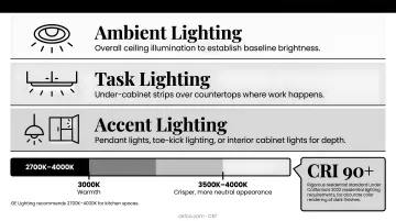
For color temperature, GE Lighting recommends 2700K–4000K for kitchen spaces, with around 3000K providing warmth and 3500K–4000K delivering a crisper, more neutral appearance. For accurate color rendering of dark finishes, target a CRI of 90 or higher — a threshold established as a rigorous residential standard under California's 2022 residential lighting requirements.
Hardware as a Color Decision
Hardware finish should be one of the first decisions in a color scheme, not the last:
- Brass and gold — add warmth to cool dark tones like navy and black
- Copper — brings earthy warmth, pairs naturally with espresso and green
- Matte black — creates tone-on-tone drama, works best when countertops or walls provide contrast
- Nickel and chrome — deliver clean, crisp contrast against any dark finish
CKF carries Top Knobs hardware across multiple finishes — matte black, brushed nickel, brass, and more — making it straightforward to match hardware to any dark cabinet scheme.
Countertop Selection
Light countertops — white quartz, marble, cream stone — are the most common contrast choice for dark cabinets, and there's a reason they appear in nine of the 15 schemes above. Dark-on-dark pairings (soapstone, black quartz, dark granite) can be just as striking when texture and finish variation are introduced.
CKF's in-house fabrication team works with homeowners and designers across its Midwest showrooms to find the right surface pairing, with materials spanning quartz, granite, Dekton, and quartzite.
Test Before You Commit
- Swatch paint colors on actual walls and observe at multiple times of day
- Order physical cabinet door samples — photos don't render dark finishes accurately
- Pull together a physical moodboard with tile, stone, and hardware samples before finalizing any decisions
Getting physical samples in hand before committing saves costly corrections later — and makes the final decisions considerably easier.
Common Mistakes to Avoid with Dark Kitchen Cabinets
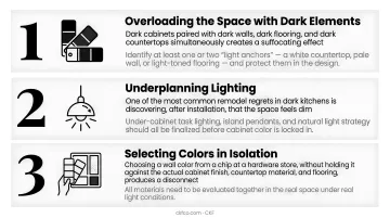
Three mistakes consistently derail dark kitchen designs — and all three are avoidable with some upfront planning:
- Overloading the space with dark elements. Dark cabinets paired with dark walls, dark flooring, and dark countertops simultaneously creates a suffocating effect. Identify at least one or two "light anchors" — a white countertop, pale wall, or light-toned flooring — and protect them in the design.
- Underplanning lighting. One of the most common remodel regrets in dark kitchens is discovering, after installation, that the space feels dim. Under-cabinet task lighting, island pendants, and natural light strategy should all be finalized before cabinet color is locked in.
- Selecting colors in isolation. Choosing a wall color from a chip at a hardware store, without holding it against the actual cabinet finish, countertop material, and flooring, produces a disconnect. All materials need to be evaluated together in the real space under real light conditions.
Conclusion
The right color scheme for dark kitchen cabinets isn't a single answer — it's a layered decision across five surfaces: cabinets, walls, countertops, backsplash, and hardware. The 15 schemes in this guide cover the full range of dark cabinet color families, from monochromatic black to bold burgundy, offering a concrete starting point for any kitchen direction.
Dark cabinets remain a high-return design choice in 2026 — particularly for resale value and design longevity. The homeowners and designers getting the best results treat lighting, contrast, and material texture as non-negotiable decisions, not finishing touches. Getting those elements right is what separates a scheme that photographs well from one that actually lives well.
If you're ready to move from inspiration to installation, CKF's cabinet and countertop design team can help you execute a chosen color scheme from start to finish.
With cabinetry, countertop fabrication, and design expertise under one roof, CKF's Midwest showrooms let you see, touch, and finalize every element of your kitchen palette in one place.
Frequently Asked Questions
What color is best for a kitchen with dark cabinets?
Light, neutral tones — white, off-white, soft gray, or warm greige — on walls and countertops create the most universally flattering contrast with dark cabinetry. Metallic accents like brushed brass or polished chrome add refinement without competing with the cabinet color.
How do you modernize a kitchen with dark cabinets?
Three updates deliver the most visible results:
- Hardware swap: Replace dated knobs with brushed brass or matte black pulls
- Countertop replacement: White quartz or light stone immediately refreshes a dark cabinet kitchen
- Lighting additions: Task lighting under cabinets and over islands opens up the space
Are dark cabinets in style in 2026?
Yes — dark green, navy, and rich espresso are among the most sought-after finishes for 2026 kitchens. The trend has shifted toward intentional, layered color schemes with thoughtful material pairings rather than uniformly dark rooms.
What not to do in a kitchen remodel?
Four mistakes consistently lead to costly do-overs:
- Skipping physical material samples before purchasing
- Underplanning lighting for the space
- Choosing all-dark surfaces with no contrast
- Treating hardware as a last-minute decision
What countertop colors look best with dark kitchen cabinets?
White quartz, light marble, cream stone, and pale quartzite are the most popular and effective pairings, delivering crisp contrast. Soapstone and dark granite work well in tonal, dramatic kitchens where texture variation carries the design.
Do dark kitchen cabinets make a kitchen look smaller?
Not necessarily. Proper lighting, light countertops or walls, and strategic contrast can make a dark kitchen feel more defined and deliberate — depth reads as dimension when it's balanced, not as constriction.